
Stella Artois Solstice Lager Launch
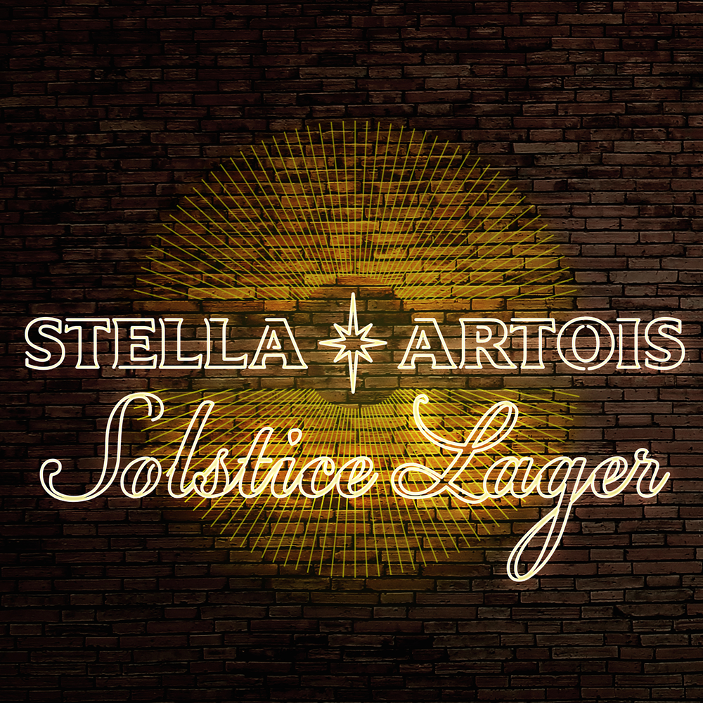
Our partners at Stella Artois asked our team with concepting and defining the national look and feel for trade materials for their latest innovation, Solstice Lager. Our team defined the materials, the overarching design language, and trade messaging, and provided insight into how to make this product soft launch as premium as possible.

The Solstice is the time when winter days become shorter and summer days become longer. We wanted to showcase the dichotomy of the two with the use of cool & warm materials to complement the golden packaging. By incorporating these two elements, we’re creating a space for Solstice to live naturally in both.
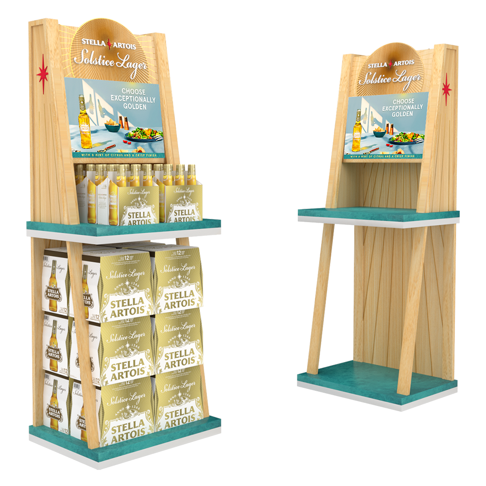
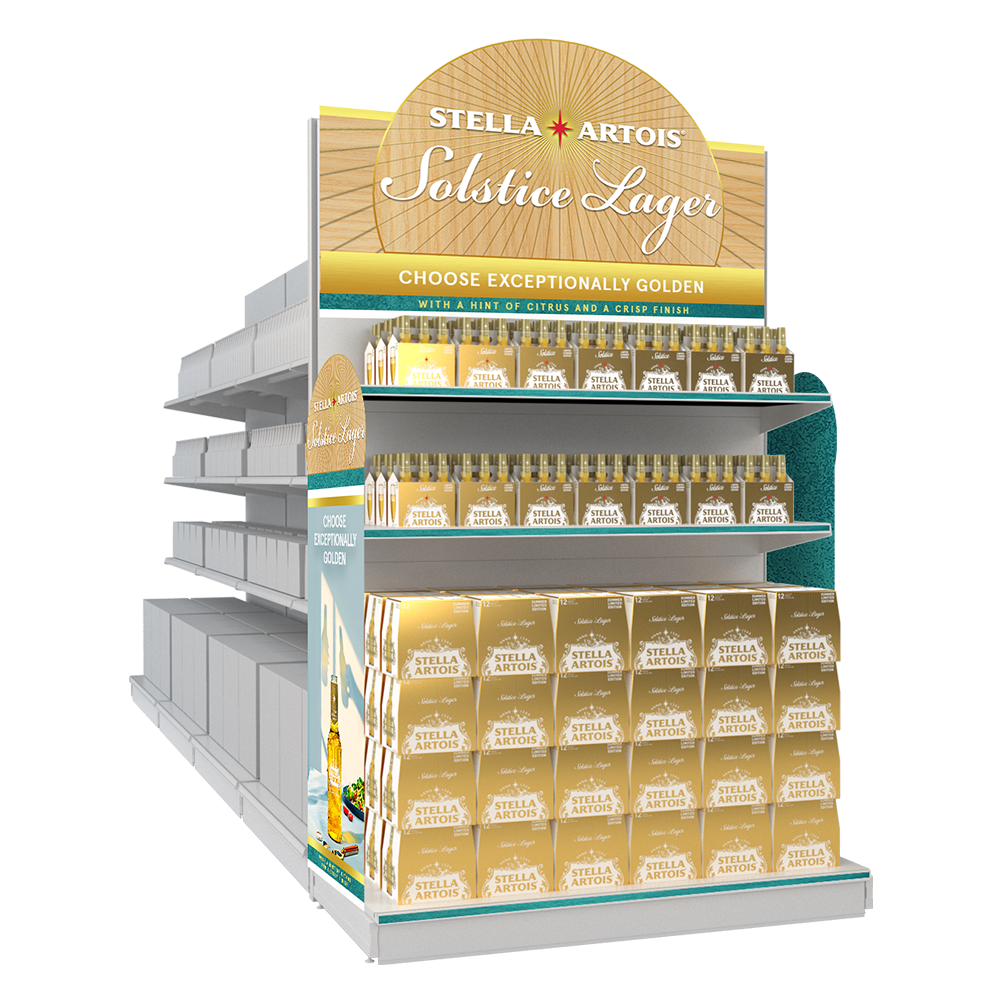


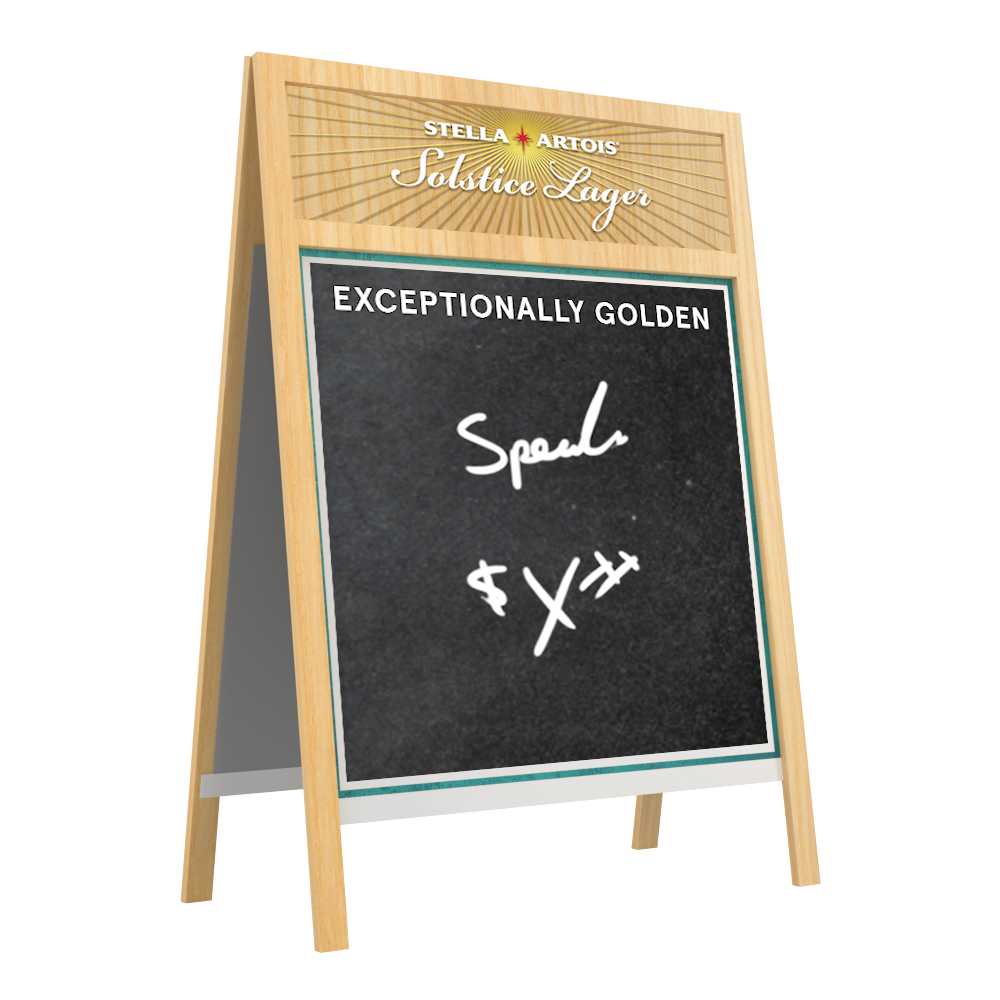

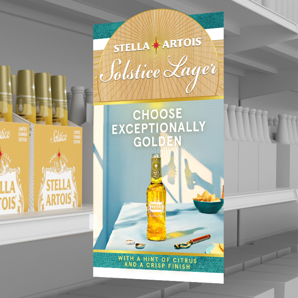


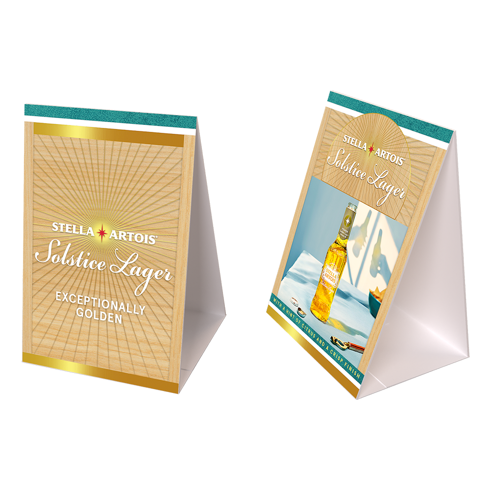


Along with standing on it’s own, we ensured that when merchandised with Stella Artois, it felt like a cohesive family.
Role:
Lead Creative/Assoc. Creative Director
Team:
VP Creative Director: Tony Mavrelis
Art Director: Jon Duong
Copywriter: Rene Otero
3-D Artist: Ed Petche
ATL Agency: Perreira O’Dell